get in touch

** I am unavailable for freelance work until January 2014 **

If you'd like  to get in touch about a freelance project or just to say hi, please send me a message using the form or via twitter at @ivonnekn.

~ Ivonne


Milton

Designer and illustrator specializing in brand identity design, web design and UI/UX design, based in Toronto via Milton.

Journal

Filtering by Category: Design

Mission 2 "Flight to Freedom" launches TODAY!

Ivonne Karamoy

For most of 2011 I've been working on Mission 2: "Flight to Freedom" and I'm so excited that it's finally out and just in time for Black History month in February! I'm eager to hear the reception among teachers and students. EFS has done some awesome things in this Mission in terms of game design, introducing things such as the escape map sequence and interface, side scrolling scenes, 3D animation sequences, game badges and smart word integration to communicate the issue of literacy in slave communities.

Side scrolling scenes

As a game artist I tackled some new challenges with this project. The background scenes and interactive environments that I had to create were of a larger scale to allow for side scrolling and a more immersive environment. As always, the character design and environment artwork required some thorough historical research to ensure the historical accuracy as it relates to the costume design, architectural details and objects. Where Mission 1 took place in Boston in 1770's America, Mission 2 takes place around Kentucky and Ohio in 1850's America around the time of the Fugitive Slave act. So the date required a whole new set of historical research.

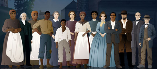
The cast of Mission 2: Flight to Freedom

Mission 2 has you in the role of Lucy, a 14 year old slave girl in a hemp plantation near Lexington, Kentucky around the late 1840's - 1850's. You are acquainted with slave life on a plantation and what it meant to be a young slave. Things happen that force you to run away and you realize that running away is a huge risk and takes a lot of courage and intelligence. You have to learn who to trust and to either stay out of trouble or be part of the resistance.

m2_otis.jpg
Fully interactive, wide, side scrolling scenes
Interact with different characters

Mission 2 has a really exciting narrative and doesn't sugar coat life for a slave. I hope the kids take away a more thorough understanding of the complexities of slave life and the political climate of the time through this game.

My hats off to the New York teams at EFS who developed the game, THIRTEEN who produced the game in association with WNET, and our historians at ASHP for the work they've done on this mission.

Read the announcement on THIRTEEN here.

Be True to Yourself

Ivonne Karamoy

The one drawback about being a creative person is you have ideas running through your brain constantly and at warp speed. Actually, let me correct myself, that's not a drawback that's what makes creating fun! But the drawback is in trying to sort through all those ideas. I am constantly looking for inspiration and because my work is mainly digital I spend an awful lot of time on my iMac. So I surf the web. Constantly. Twitter, especially, makes it easy for me to follow people who inspire me and I see and am introduced to more and more things every day that inspire me. And as most creatives are, I am an avid note taker. I make notes, I bookmark links, I draw sketches, I buy books... anything and everything to try to jot down my thoughts for later reference. This is great but I'm constantly inundated with stimuli. The difficult task is to sift through everything and find something that truly means something to me and is inspirational in a way that allows me to be true to myself.

I admire a lot of designers in the web industry, in illustration, in graphic design, in fashion design, in art... there's so many! And I'm guilty of looking on in awe and failing to refine my style. I'm still trying to find it. I don't even know how to define my illustration style... accurate is the only word that comes to mind and that's such a boring description of something that should be so free and creative. I'm so OCD about my art that I stress over inaccurate details, which can be a good thing but also a hindrance to developing personal style. If art school taught me anything it was to make work that is you, there is no perfect in art, there is only true genuine reflection of you and what you perceive.

I guess more important than developing my personal style in my work is to be true to me. To be instinctual enough to make decisions based on what I like and what works for me - or, of course, my clients and their projects. Basically, what makes sense to the project at hand. There's always going to be designs and illustrations that you look at with envy because you admire them so much, but they may not be appropriate for the work you are producing and more importantly, they're not you.

It's also about being confident in your work to know when to stop. Art school also taught me that. You can constantly rework things, redesign things, redraw things, but the best artists are those who know when to stop. Take the abstract expressionists for example. To us looking on it seems that they haphazardly placed colours on the canvas until they got tired. But they made elaborate decisions on which would be the last brushstroke.

In my current efforts to redesign my website I am currently at the third iteration of my redesign. And yes, of course, experimentation is a part of design, but I can't keep changing my mind every time I think I've finally come to a decision. I need to stop looking at other people's websites and do what is true to me and when that happens I'll know to stop. I need to try to listen to my instincts and not try to emulate something I admire but let my ideas flow. I'm sure my struggle isn't a unique one. It's a constant struggle for creatives. And maybe the equivalent of a writer's block for artists is not just a lack of ideas and inspirations but also too many ideas clouding your own. The only thing I can think to do now is to stop looking at my favourite designs, stop looking at other websites, stop following links on twitter. Return to the sketchbook, clear my mind and try to hear my voice amidst the chaos.

I suspect that the process of sifting through one's ideas and finding one's voice doesn't end. It's there with every thing you create... in fact, it constantly happens through life. So I'll also try not to be so hard on myself and just let things go... Besides as artists and designers we hope to always do better and better work so the process is constant.

Where has the time gone?

Ivonne Karamoy

When I look back at the last couple of years a lot has happened, and I mean A LOT! And the last few months have been eventful but the wheels are starting to slow and the dust is settling. In terms of my professional life though, well, I'm happy to say that it has been steady, consistent and now is kicking into high gear!

Mission US

I've been working on Mission 2 of Mission US with the guys at EFS for over the last year and I am extremely excited. This mission is so involved and so rich in content! I think kids are really going to enjoy it. The preliminary reviews have been great and the teachers and students are anxious for it to come out. We finish production in January 2012 so it's crunch time!

Weddings!

This past year a few of my closest friends and my sister got married. The festivities were wonderful! As most designers know, it is almost a given that one or some or most of your friends will at some point or another ask you to design something. For wedding invitations, this is almost always the case. Of course we don't do this for everyone but when it comes to our nearest and dearest I consider it an honour.

So first there was my sister. Her and her husband were together for over 11 years before they got married. They're both finance professionals who met at work and over the course of a decade fell in love :) My sister and I are very close and so I came to know their relationship well and learned about their style fairly quickly. They're both smart, funny, kind and intimately warm people. Their style has developed through years of corporate travelling and business shmoozing, which means they love an exclusive restaurant with delicate, expensive wines and they have great taste when it comes to everything they buy. While I lived in New York I was lucky to be rooming with them because it allowed me to live in a West Village penthouse and a Lower East Side apartment with granite countertops. If it wasn't for them I'd still be up in Harlem in my shoebox of a room with a wall built by a drunk mexican and which I rented for what some people pay for a mortgage in the suburbs.

Anyway... I knew when I designed their invitations that it had to reflect their taste but still be classic and simple. So I went about designing and thought first of a logo or monogram for the couple. It would be the unifying element for the printed items. I was pleased that the design of their logo developed quickly and easily. My sister was very particular about what she wanted the wedding to be like so she tweaked the design in her own ways and I obliged. In the end, I think I came up with a design that reflected them both well.

When I designed the logo, I wanted to communicate their years of travel or at least their travelling lifestyle and since Toronto was their home, New York was where he proposed and Singapore is where they would start their married life, it was the perfect trio to include. I also looked to wine labels and liquor labels for inspiration. And when my sister told me she wanted letterpress invitations I was thrilled because everything looks so chic in letterpress, in my opinion. In addition, their venue was St. George's Golf & Country Club in Etobicoke, which has beautiful surroundings and interior details - think mahogany staircases. The interior exudes a certain old worldly charm so I wanted to give the invites the same traditional look that would reflect the reception.

The final design was printed on an ivory card stock with a deep purple ink for the lettering. The monogram was pressed on with the same colour ink as the paper to have a reverse emboss effect. I opted to position the monogram a bit off tilt so as to feel like it was stamped individually by hand. They loved the way it turned out and I'm very happy with the result. What was even better was that the printer could print the invites on just one plate because none of the areas overlapped so they could run the invites once for the text with the purple ink and a second time for the monogram with ivory ink.

The invite and matching RSVP card was printed in letterpress, but the map was printed on a thinner card stock on a home printer. Because the church and the venue was quite a distance away (about an hour drive) and a lot of guests were expected from out of town, I drew the map myself to highlight only the important roads and have space to provide directions.

Overall, I think the invitations look great and I was honoured that the couple loved it. I think it set the tone for the wedding and the reception dinner.

IMG_2449.jpg
IMG_2471.jpg
IMG_2538_2.jpg
IMG_2532.jpg

The New AlexShakar.com

Ivonne Karamoy

About a year and a half ago I was contacted by Alex Shakar, who I met while I was in New York working at EFS, to do illustrations for his upcoming novel. His previous works have garnered critical acclaim and he is an accomplished author and professor. Fast forward to today and that novel is being published with a release date of August 2011! Congratulations Alex! Upon this years release, Alex contacted me again to redesign his website and I am honored that he would come to me to complete his vision. Alex was a pleasure to work with as he was patient and always available for collaboration. Together we came up with a redesigned website that reflected the elegance, simplicity and artistic vision he had in mind. We also architectured the site around Wordpress so we could allow him to post updates and appearances around the new novel easily. He was very happy with the new site and I am grateful to have had the opportunity to work with Alex once again.

Check out alexshakar.com and discover his writings. You can also preorder your copy of the upcoming novel, Luminarium, now!